A few years after Section 508 (web accessibility of US Federal sites) became an enforceable law in 2001, government agencies were very interested in having blind users actually try out their web pages to see if the pages were accessible. I remember 2004 – 2005 as the peak time for these kinds of user research initiatives. Later, however, thing shifted. The standard for evaluation of accessibility became a code inspection, with the understanding that different technologies had different ways of compensating for coding errors. It would be virtually impossible, therefore, to truly assess accessibility only by watching blind users interact with the site.
Since 2006 and until last month, a small but ongoing portion of my time had been centered in accessibility. During this time, I did not do accessibility research with representative users since none of my clients wanted this service. Instead, I mainly did manual code inspections to determine whether webpages were accessible. I also did a lot of training of web teams to make sure that they understood what they should be doing in the first place.
Last month, however, I was approached by a client who wanted actual user research with visually impaired users who rely on screen readers. The client had not done any kind of code inspection, although the web development team did have some knowledge of accessibility. While I felt comfortable with my skills in conducting this kind of research, I suggested that my time would be best spent doing a code inspection before even considering user research. However, the client said that they really did want the user research, so the project went forward.
The research project turned out to be a great experience for me, and in the end, I really appreciated that the client pushed for this project.
The user research was a success.
We obtained a ton of useful data and identified many accessibility problems. And I honestly found this to be a very exciting research project. Not only did I have a valuable opportunity to actually see blind users interact with the interface on laptops, but half the users also brought an iPhone so, for the first time, I got to do mobile accessibility user research.
As I was drafting the project report, I decided to actually do a short code inspection in order to improve my understanding of the accessibility problems that were observed during the study.
The code inspection only identified two additional problems in the code that were not already brought to light from the user research
One code-related finding impacted only sighted users who would be using their own style sheet to better see the page, and the other was a best practice but not a real violation.
The user research found most issues and was able to supply powerful video clips!
By and large, however, the user research revealed just about everything an initial code inspection would have picked up and provided me with a plethora of video clips showing not only issues but the frustration the problems caused. I was then able to share these video clips with the development team and potentially have an impact that was more powerful than a dry and technical code inspection report would reveal.
There were findings that a code inspection would not have picked up.
There was one instance where a link to a privacy policy was included within the form label of a checkbox to indicate agreement with the privacy policy. The form label was coded correctly, and I have never seen any guidelines to indicate that links cannot exist within form labels. On the iPhone touchscreen, however, one person meant to touch the form label to check the agreement checkbox but instead tapped the link.
That link, in turn, opened up a new window. The only guidelines that I’ve seen about new windows are that users should be notified in advance (these are WCAG guidelines, not section 508). While technically, again, the code inspection would not have found any major faults, the user became very confused. When I eventually needed to get her back on track, I told her that a new window had opened and she needed to close it. She assumed then that it was a modal window with the privacy policy, not a separate Safari browser tab. It took her a long time to figure out how to get fully back on track.
There were several instances where some interaction between the screen reader and JavaScript code on the site seemed to temporarily “lock” fields for editing, and there were also several instances for users when after completing a particular form field, they were bounced up to the top of the screen. A code inspection (on a computer without a screen reader) did not reveal that anything was abnormal or otherwise problematic.
WCAG guidelines are so much more robust than Section 508.
Since this research was in the private sector and potentially had international ramifications, the client asked me to use W3C Web Content Accessibility Guidelines (WCAG 2.0). With my DC client base, by and large, most of the accessibility work I do is to the Federal Section 508 standard. When I wrote my report using the WCAG guidelines, I was able to reference information that was so much more clear and concrete than the Section 508 guidelines that I usually have available to cite. I should point out, though, that Section 508 is hopefully going to have what they are calling a “refresh” soon, which will very likely get it much more into synch with WCAG 2.0.
My recommendation: do a code inspection, and then do user research.
Going forward, I will no longer tell clients that a code inspection will accomplish all of their accessibility goals. Instead, I will recommend an initial code inspection and then give the team an opportunity to fix any issues that the code inspection revealed. After those problems are fixed, if budget permits, I’d recommend bringing in visually impaired users with their own software and software configuration.
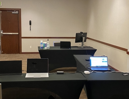
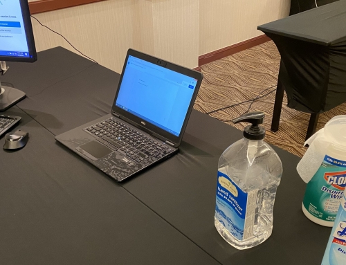
Participants with PC and Mac laptops could bring these in. While in theory there could be a difference between a home desktop and a laptop, at the client’s request, I probed participants, and it seemed that the only common differences revealed between desktop and laptop configurations were a larger keyboard with more efficient data entry, as well as better speakers. PC users could be recruited to use several screen readers: most likely many will use JAWS, but having at least some Window Eyes and NVDA users could be valuable. Mac users would most likely be using VoiceOver.
If testing on mobile as well, mobile users could be recruited to use iPhones (which is likely what a majority would have) and Android devices. It may also be useful to include tablet form factors as well as phone form factors, particularly with a responsive design that may render differently on different sized mobile screens.
Hand and Shade Image Courtesy of Santiago Cornejo / Bigstock with overlay added from W3C WCAG 2.0 guideline landing page and section 508.gov homepage


