My flight arrived into Boston right on time, and I smoothly made it to the hotel with plenty of time to spare before my first participant was to arrive for some conference usability test sessions. I used the time to check into my hotel room and was assigned to the 33rd floor. Nice – I’d have a great view of Boston from my room.
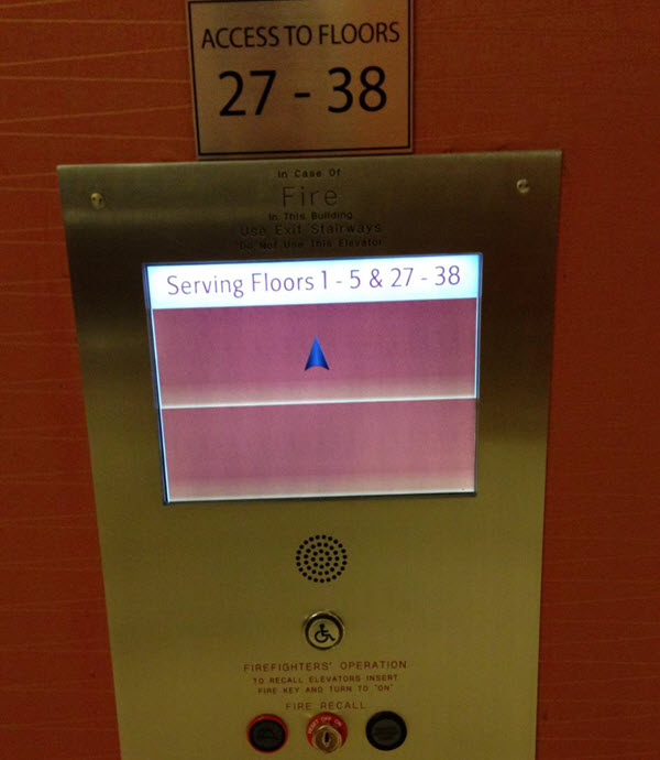
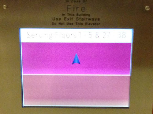
I went over to the elevators and quickly noticed that one bank of elevators were for guest rooms up to floor 26 and the second bank of elevators were for those guest rooms that were floor 27 and up. I walked over to the latter bank of elevators and stood there. Where was the call button? All that I could see was a light pink glass screen with an arrow pointing upward as well as a single button with a handicapped symbol on it.
I was really stuck and didn’t know what to do until a guest that had already had experience with the elevators in prior days arrived on the scene and pressed the glass. Only then did I realize that the glass was actually a touch screen. And the top half of the glass, with the arrow pointing upward was actually a giant call button.
I take pride in staying on top of the latest trends in technology – I am quite familiar with touch screens and own iOS, Android and Windows touch screen devices. I had just done a touchscreen user experience evaluation on a kiosk in DC. Yet that elevator really threw me – Why? And what can we learn from this?
Just because a current technology makes sense and is expected in one context doesn’t mean this technology will make sense in any context.
Maybe the attempt was to “future-proof” the elevator functionality during a recent renovation, and touch screens do add a lot of value to many products. However, I still struggle to see the value that this particular touch screen adds to the user experience for those who need to use the elevator. The ironic thing for me is that while there was a screen there, the key piece of information that I wanted to know was what floor the elevators were on so that I could know how long I’d be waiting or what the progress was in having an elevator respond to my call. Yet this information was nowhere to be found.
Familiarity means a lot.
I recently came across a webpage that had images that could be clicked to view a related video, yet nothing about the image suggested that it was a gateway to the videos. Similarly, users will expect to see buttons at an elevator, so create an image that reflects this expectation and also makes it clear that the screen should be used to call the elevator.
Put instructions in the right location so that they can be seen at the right time.
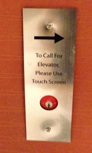
When I do expert usability reviews of websites and find instructions that are on a separate page from where they are needed, I recommend that these instructions be moved to, or at least reiterated at, the location where they are needed. In addition, while the former issue might result in users forgetting important information once they need it, coming into a site via a search engine might mean that users bypass directions entirely. In the case of the metal-plated instructions on a wall near the bank of elevators, the instructions were so far removed from the actual screen that I was not even aware of them as I approached the elevator nearest the screen. In this case, the instructions could have been right on the touch screen if less space was used for the large rectangular buttons.
Clearly note the selected state.
Strive to create an interface that is universally usable without needing alternative pathways to key functionality.
I did not try the button with a handicapped symbol on it, but it appeared that there was a speaker grill immediately above it, so my assumption was that this reached some office where someone could call the elevator remotely. Yet it seems that someone who was visually impaired could end up touching the screen inadvertently and perhaps call an elevator headed in the wrong direction. There would seem to be a number of ways that the system could be developed so that someone with visual impairments could use this elevator.
- Since the elevator was clearly being designed to be high tech and futuristic, the elevator functionality could include audio, ideally with a proximity sensor of some kind. When a person first arrived within a few feet, it could provide simple instructions on usage.
- Touching the screen could announce what function had been activated.
- If the elevator actually had more functions, a separate button could turn on screen reader functionality, similar to the functionality built into iPhone, Android and Windows.
- The key instructions that were far away from this screen, and could be displayed on the screen itself, could also be placed in braille next to the screen.
Of course this all seems a bit much for an elevator call button – a regular set of elevator buttons would do the trick just fine!
